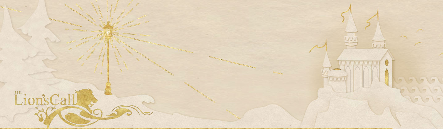
I've been working on a portfolio of illustration and typography based on the Silver Chair. In keeping with the spirit of the New Year I'm posting what I'm working on here as a way to motivate me to keep adding.


Nice, Tooky!
Those are really good, Tooky! 🙂
pretty!
For a moment, I was wondering why you had something that looked like the Ubisoft logo in the middle of the lantern. Then I realized that it was the copyright symbol. *headdesk*
Very nice work, Tooky; I'm looking forward to more whenever you've got more!
*thinks she recognizes the cursive font used*
Ooh, nice! 🙂
Thank you 🙂
Yeah, I knew I needed to watermark it and I did it last minute. If I end up putting it in my portfolio I don't want there to be unedited versions floating around....
And the font is called "Jane Austan", it's one of my favorite freeware fonts, nice look and fairly easy to read for a script.
I'm thinking about what I want my next piece to be. Possibly a fire salamander or an owl, not sure though.
Ah-ha! I knew I recognized the font. I quite like that one too. 😀
Beatiful Tooky. The copyright sign also threw me off in the first two, but obviously you need it :p
My favourite is the LotGK one
Once a daughter of Eve. Now a daughter of the Second Adam.

I'm kinda late to the party to say this, but those are so cool, Tooky! 😮
Thank you, Hobbit!

These are amazing. The colors come off the screen and I especially like how the lines behind LotGK look like a biohazard symbol.
Thanks for sharing!
Jesus answered, "I am the way and the truth and the life. No one comes to the Father except through Me. If you really knew Me, you would know My Father as well." - John 14:6-7a
Amazing tooky! They're all fantastic, but I love the lantern especially!